


What's the secret hidden in Cocon's box? Sette Pieghe Edition
Everything COCON offers is part of the product
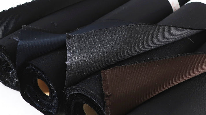
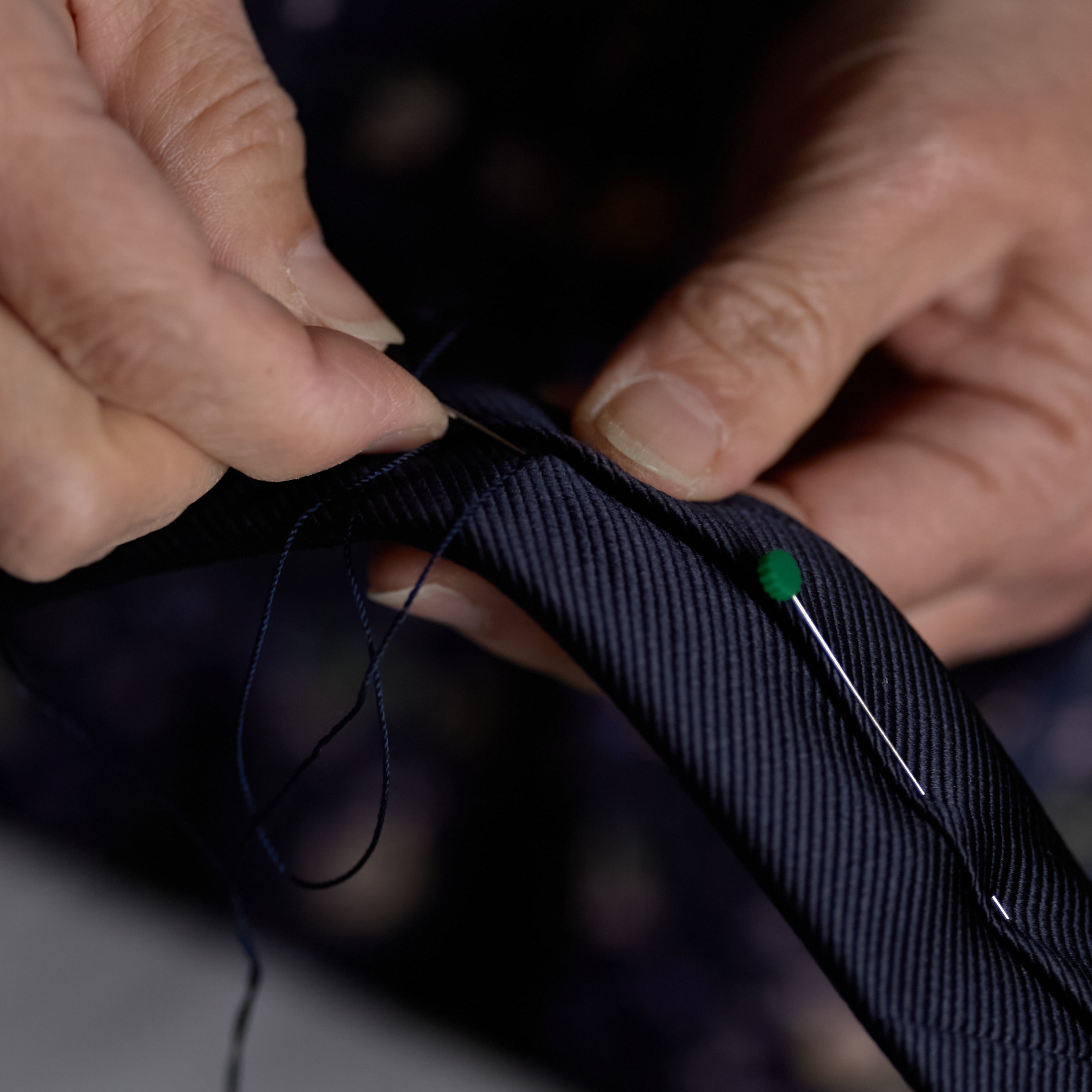
COCON products encompass everything we offer, from the products themselves, such as ties, to website information and packaging materials. We strive for high quality in every aspect of our service.
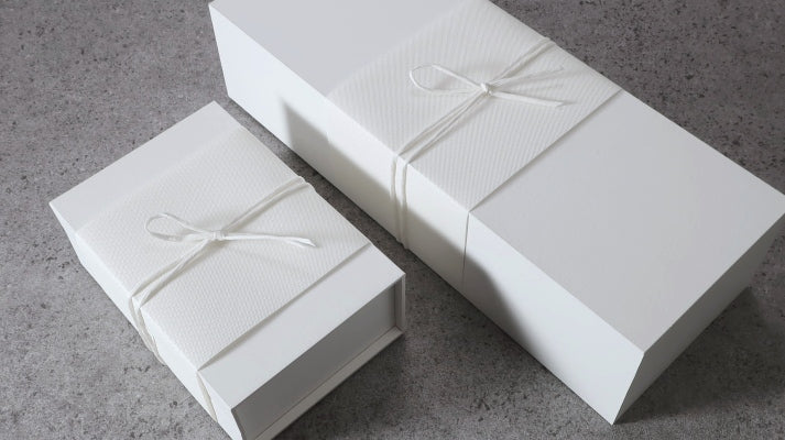
Among these, what we'd like to introduce today is the box used for the Sette Pieghe model. While you might dismiss it as "just a box," it's filled with COCON's unique attention to detail.
First, its simple appearance

COCON's white box has an extremely minimalist presence, deliberately stripped of embellishment.
The star is always the tie nestled inside, not us. That's why the box values the "negative space" that quietly exists without speaking loudly.
The color white is like a vessel that accepts everything and enhances everything.
When a customer opens the box, there is a space where the giver's feelings, the recipient's time, and everything else blend in seamlessly, rather than the brand's assertion.
COCON aimed not for a self-assertive package, but
a supporting role that gently holds the feelings for a loved one.
Its understated whiteness enhances the beauty of the tie itself,
and quietly watches over the beginning of "one knot."
The "presence of white" that quietly emerges

The COCON box features an extremely subtle logo, applied with a white-on-white special process.
Rather than asserting itself with color, this "white logo," which shows its presence only through shadows that gently emerge depending on the angle of light, is a symbol of the understated aesthetic we value.

Furthermore, there's a small "cutout" on the side.
Behind it, a COCON icon quietly resides, hidden as a small discovery that can only be found the moment you pick up the box.
This mechanism, which never steals the spotlight but definitely exists, is intended to gently deepen the relationship, just as the time between the tie and the customer is spun.
A logo layered white on white, and a subtle cutout.
Both are COCON-esque presentations that embody "beauty that doesn't over-explain."
Invisible ingenuity that beautifully protects the tie

COCON's boxes contain numerous "behind-the-scenes ingenuities" that go beyond merely storing ties.
First, a dedicated paper insert is placed inside, carefully supporting the tie's interlining and three-dimensional form to prevent it from losing shape. Additionally, by creating height between the box and the insert, excessive pressure on the tie is inhibited. Furthermore, the cross-section of the insert is designed so that the curved surface of the insert touches the product, preventing direct contact with sharp edges.
So that the beautiful knot shape is not damaged until it reaches the customer's hands.
This silent support was born from that desire.

Furthermore, an arched cover paper gently protects the tie's surface.
It creates a soft space without directly touching the fabric, gently protecting precious silk from friction and pressure.
The "elegant tension" felt at the moment of opening is also one of the things created by this arched paper.
It may not be conspicuous, but it certainly fulfills its role.
These are precisely the "behind-the-scenes aesthetics" that COCON values.
